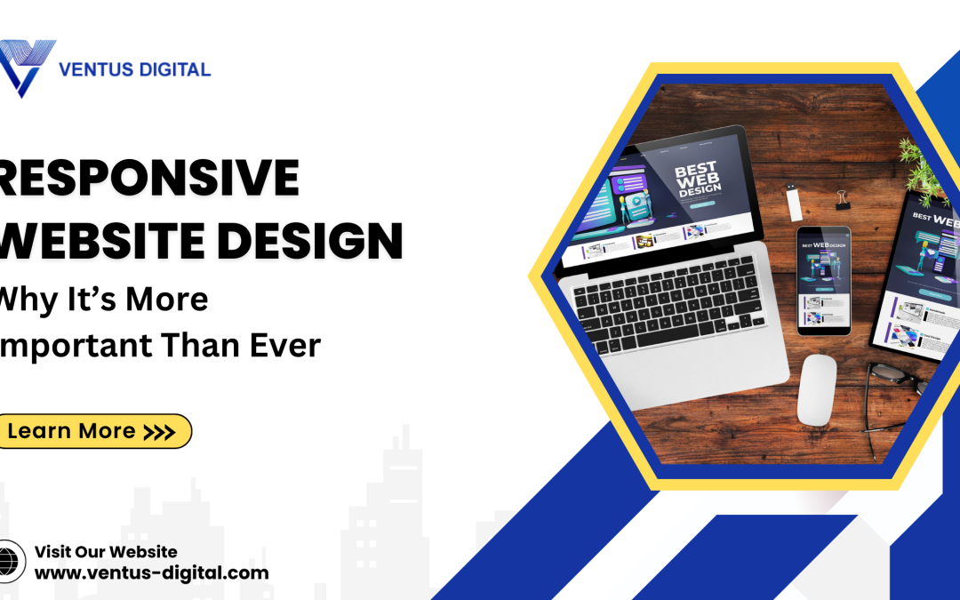
Responsive web design may be described as the approach that aims at creating web designs that fit the screen size on which they are being viewed. Responsive design ensures that the website’s appearance as well as functionality is properly adapted to any device that is used, be it a PC, tablet, or smartphone. It alters the shape and size of what is on your website to fit the screen it is being viewed on.
How Does Responsive Design Work?
Responsive design is a technique that adjusts the layout of a web page, the size of graphics, and the style of the specific device. Of them, ‘responsiveness’ means that while designing the website, one has to adapt it to the screen sizes, pictures also adapt to the screen size, and different styles are employed so that the site looks good on all devices.
Why is Responsive Design Important?
It is important to adopt this form of design as it enhances the fun of the users when they are accessing your website regardless of the device they are using. It also helps your site have a better position on Google since Google prefers sites that are mobile-friendly. This means that more people can locate your site in the search results. A firm’s constant and user-friendly website also leads its users to take such a course of action as purchasing or completing a form. Lastly, responsive design guarantees that your website will operate in harmony with the new devices that are launched in the future, such as foldable phones.
Responsive design Implementation?
For many, the first step to achieving the goals of responsive design is base designing for the mobile-first and then expanding the design. It is recommended to incorporate layouts that could easily adapt and transition from one format to another format compatible with the screens of devices. Ensure that the images that are used take less time to load and are optimized for the device that is being used. To help customers find your website via a search engine, take time to look at your website on different devices to verify that its appearance and functionality is good.
Responsive Design is the solution to this problem:
We use many different devices to view websites, like computers, tablets, and smartphones. Because of this, your site needs to work well on all these devices. You never know what device someone will use to visit your website.
This number will keep growing as more people get smartphones.Statistics show that it’s smart to appeal to both desktop and mobile users. The number of people using mobile devices to view websites is higher than those using desktops.
In early 2015, Google announced that mobile-friendly websites would rank higher in search results. This means websites that are not mobile-friendly might not show up as high in Google searches because they don’t provide a good experience for mobile users.
Benefits of Responsive Website Design
-
-
- Cost Effectiveness
-
It can be costly when one has to host two sites: the mobile users and the non-mobile users. Responsive design entails designing one site that is optimizable across the various gadgets in use. This is economical since people do not have to develop another site for mobile users.
-
-
- Flexibility
-
If say a company has a responsive website, it is easier to carry out changes or updates. Unlike when creating a new account with no earlier activity, you do not have to make the change on two different sites. Of course, if you’d like to adjust the design or correct some typos, you only must do it once.
-
-
- Improved User Experience
-
The user experience is rather central to things. It owes much to courtesy which aims at getting users to like a site and ease of use which is the natural extension of courtesy. If your site takes hours or days to open or pictures are not clear or cannot be viewed on mobile, it gives a raw impression of your company.
-
-
- Better SEO
-
SEO (Search Engine Optimization) assists your site to feature higher in a Google Search Engine Results Page. Responsive design assists in SEO since Google, and other search engines prefer sites that have mobile-first design standards.
-
-
- Easy Management
-
Being in charge of one site makes work easier and is time-saving as compared to having to maintain one site that is desktop-based and another that is mobile-based. It is quite flexible to make changes without having to consult a designer or having to spend huge amounts of money.
-
-
- Some drawbacks include:
-
-
-
-
- It is constantly anticipated that not every site appears to be flawless when viewed through distinct gadgets.
- Small ads or banners might not look attractive may result in the need to reshape them.
- Building an exclusive and branded responsive site on your own proves to be a bit of testing.
However, most users reaffirmed the importance of using the responsive design due to the ease of using the sites on mobile devices. For instance, 61% of mobile device users will exit from a site within a few moments if they are unable to find what they want or if the site is not opening fast enough.
-
-
Why Choose Ventus Digital?
Ventus Digital offers amazing services on website designing and development with attractive and responsive websites. We have professional staffs, with adequate experience in web designing and web development for decades. Our websites are designed to solve your problems and fulfill your business objectives. Our designs assist your site to get better positions in the search engine indexes, and we regularly upgrade and assist with your site to work proficiently.
Are you ready for a new, better website? For your business and require a professional, responsive, and standout website; contact Ventus Digital now!
Conclusion:
Responsive design is important as it enables the website to be well displayed and navigable in all the gadgets, enhances the user experience, improves the website ranking in the search engine as well as minimizes the use of time and money in creating a different site for the different gadgets.
FAQS:
-
-
- What is responsive design?
-
Frequently, it is concerned with making the site look and function properly on all devices such as PCs, tablets, and handhelds. It adapts to the size of the display repairing the layout and content of the Web page.
-
-
- What is the relevance of adopting responsive design?
-
Responsive design is necessary because it enhances usability, has a positive impact on SEO results, is less costly than designing multiple sites, and guarantees that a site is ready for future gadgets.
-
-
- In what way, does responsive design implement the SEO needs?
-
It should be noted that Google pays special attention to the site’s compliance with the rules for the use of mobile devices. Through the help of a responsive design, it becomes easier for your website to have a higher ranking hence more visitors.