Website Design
Detailed Case Study
www.thebigchillonline.com
Project goals
Modernization
Create a contemporary and visually appealing website that showcases Nihao Logistics as an innovative and cutting-edge technology partner.
User Experience
Design an intuitive and user-friendly interface that enables visitors to easily navigate through services, case studies, and resources.
Responsive Design
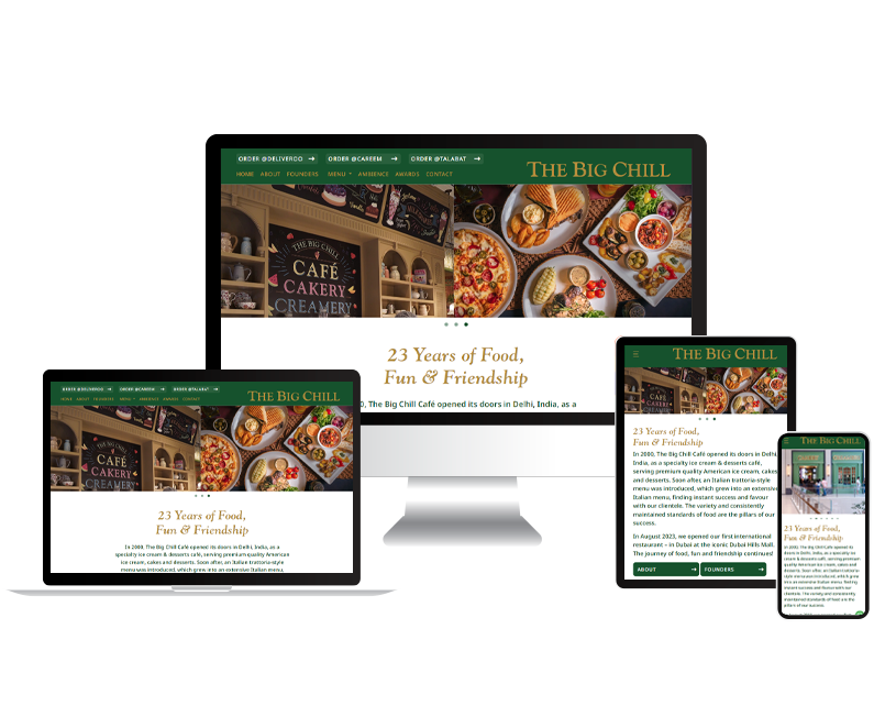
Develop a responsive website that works seamlessly across various devices and screen sizes.
Content Organization
Improve the presentation of services, case studies, and blog posts to help visitors find relevant information quickly.
Design approach

Visual Identity
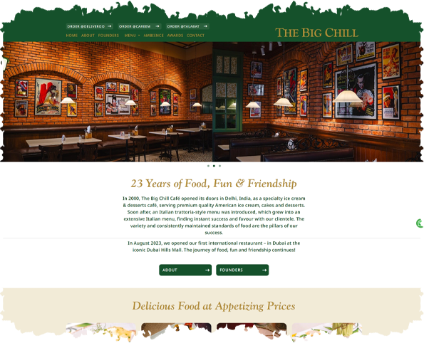
We began by revamping the visual identity of the website. The color scheme was updated with vibrant red and modern grays to convey professionalism and innovation. Bold typography was chosen to enhance readability and create a contemporary aesthetic.

User-Centric Navigation
We restructured the navigation menu to be more intuitive. Services were categorized by verticals using a mega menu so users can find information efficiently.

Responsive Design
To ensure a consistent user experience across devices, we adopted a mobile-first approach. The design was optimized for various screen sizes, from desktop monitors to smartphones.

Services Showcase
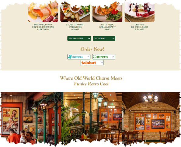
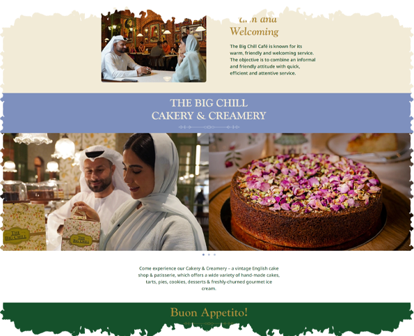
Each service offering was given its dedicated page with detailed information, benefits, and relevant case studies. This allowed potential clients to better understand the value proposition and expertise of The Big Chill.

Strong Calls to Action
Throughout the website, strategically placed calls to action encouraged visitors to contact the company for inquiries, consultations, or to request more information.

Wireframe plan & design


Conclusion
Behind the scene case studies
A must read, if you want a professional website


